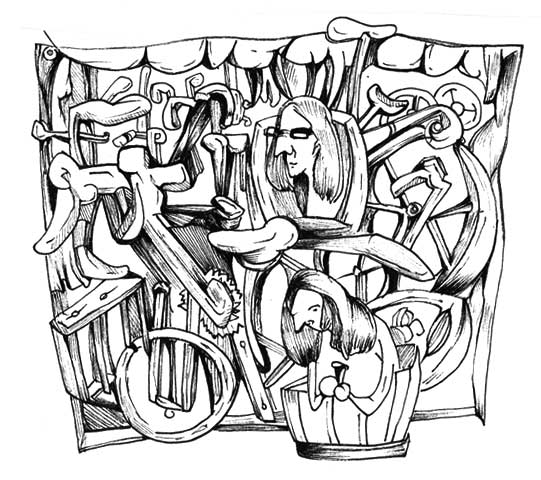
I went to Hawaii to celebrate my birthday a few weeks ago, which is what inspired this little cartoon you can see here. May we all age as gracefully as a sea turtle.
What I Learned Drawing a Bi-Weekly Comic for a Little Over a Year
I’ve been drawing The Worried Well regularly for a little over a year now, and have slowly progressed from the Not Sure What I Am Doing phase to the Why is This Getting Harder, Not Easier? phase, and finally, onto the Huh, Surely I Should Have Run Out of Ideas by Now phase. This seems like as good a time as any to write about What I Learned in list-fashion, so on that note:
What I Learned Drawing a Bi-Weekly Comic for a Little Over a Year
1. If you don’t have a lot to say on a topic, don’t push it.
As some of you may remember, in 2015 I created a mini comic called The Illustrated Guide to $14 Cocktails. A few of the individual cartoons are still lurking around online, but overall I consider it one of my weaker books. But what happened? It sounds like it would write itself, no? Those overpriced drinks just begging to be mocked! All of those fancy ingredients only a handful of people could possibly care about! And so forth. But in the end, I ran out of things to say about pricy cocktails pretty quickly—I had maybe one or two cartoons worth of material that I tried to stretch into a book’s worth, and it just didn’t work. (Also, how do you write about drinking expensive cocktails without sounding like a jackass? Serious question. Please tell me.)
There are, however, LOTS of things that make me legitimately opinionated: the overabundance of Book Shaped Product (ie, contentless drivel packaged up nicely), inspirational items that are really not, Richard Price, the so-called circular firing squad of the left, feeling powerless and infuriated at our current administration but how we cannot use that as an excuse not to act, introvert fetishization, my controversial stance Valentine’s Day is actually a wonderful holiday, not feeling the way you are “supposed” to feel, and many others. My general rule is that if I encounter a topic that makes me want to go on a drunken rant, I might have something I can work with.
2. No one cares about the drawing. Except other artists.
I knew this going in of course, but seeing it play out in real life is vaguely depressing.
3. Nib pens are your friend.
The advantage of using a nib pen? It slows you down and forces you to work in one place. The disadvantage? It slows you down and forces you to work in one place. Right now my favorite tools include speedball 512s, square yellow Post-It Notes for doodles, an assortment of Japanese Pilot pens from JetPens.com (thanks, Eric!), and various glass trays I purchased at thrift stores and garage sales for palettes.
4. It's important to finish things.
To paraphrase Tom Hart: "You can be the type of artist who finishes things or the type of artist who hates himself." And weirdly, one of my proudest accomplishments last year was applying for a cartooning residency I didn't get into. It was only after I completed the application that I figured out what I wanted a collection of my work to look like.
5. It's still way more fun to draw stuff that doesn't have to make any sense.
Easier, too.
The Creative Process, Parts 1 - 6
As an artist, I’ve been fascinated by the amount of material that has suddenly blossomed about the “creative process.” Not only is it impossible to open my email without a barrage of “7 tips for boosting your creativity”-esque clickbait, there are now journals to help you along, Tarot cards to spark ideas, collections of inspirational quotes, coloring books up the wazoo, and all sorts of stuff I’m probably forgetting.
And what always fascinates me is how little any of it helps when I sit down to actually work. The most they can offer me is solidarity; a “hey, it’s hard for all of us, isn’t it?” reassurance that’s handy to have in the back of your mind, but completely useless when trying to figure out what to draw and how to draw it. Perhaps for that reason I’ve always been more consoled by works like Isn’t It Romantic?–the brilliant 2011 David Rakoff essay where he describes in beautiful, agonizing detail the process of how a day devoted to writing will so easily go from “Pregnant with Potential” to “Freighted with Failure,”–than I am by encouraging posters.
This is not to say I think less of the people who find books or journals about creativity helpful. It’s easy to roll your eyes at titles like “Unleashing Your Inner Something-or-Other” (and I may gently mock them in my cartoons now and then) but if someone feels as though they finally have “permission” to draw or paint thanks to a book, or a think piece, or even a wine and paint class, only a churl would begrudge them for it. (Besides, the fact that adult coloring books are a thing now can only lead to more jobs for artists and illustrators, so I’m sure as hell not complaining.)
My Creative Process series adds to the pile of these guides, but without offering any useful advice whatsoever. The goal is just to show what it’s like for me, and, because I’m not particularly unique, what it might be like for other people. I finished it last spring but never got around to posting it, so Parts 1 - 6 are below:
Some recent nonsense
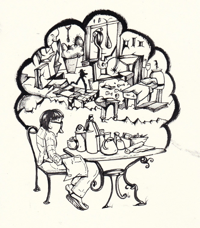
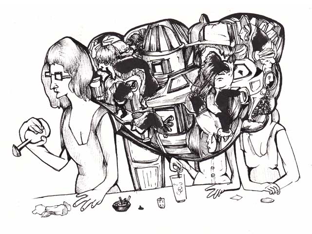
I mentally file all of my artwork into two crudely-labeled piles: the Kind That Makes Sense, and the Kind That Does Not Make Sense. Generally speaking, the Kind That Does Not Make Sense is more fun, though it often arrives by accident when I'm aiming for the making-sense-type of art. Here are a few recent examples.
Below, I was trying to draw what I can only describe as a “pile of crap” for another cartoon (long story), and this is what wound up happening.
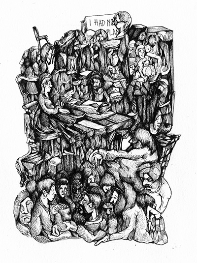
Below is a drawing I started at a restaurant a few months back. I was doodling the guy at the table across from me, and it all snowballed from there:
Oh, brunch!
Here is me having fun with heads in profile, and a new slant-angled Micron pen:
It took me awhile to realize that there's a sweet spot with weirdness in art: too strange, and it becomes off-putting, and too normal and well, what's the point? You have to be unusual, but still give the viewer something to cling onto. Being weird can also be used to disguise a lack of ideas, or talent (see how many artist statements abandon explanations in the first place, and just spout gibberish as a means of distractions).
Social Media Fairy
New comic! Like everyone else, I have love-hate-why-did-food-receive-more-likes-than-my-drawing-what-is-WRONG-with-you-people type relationship with social media, which I tried to illustrate here:
A few new cartoons
Who doesn't love to complain about the creative process? Definitely not creative people, I can tell you that much!
I may decide to do a cleaned up, non-sketchy version, but I like the spontaneity of this one for now.
Another semi-fatalist cartoon:
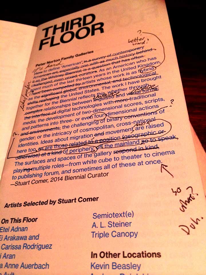
The Whitney Biennial Curator's Statements, Edited (sort of)
I don't have a whole lot to say about the Whitney Biennial. Overall it wasn't a very good show (as a lot of other critics have pointed out), with many of the paintings looking not unlike ones you often see getting hawked at Eastern Market, except maybe with more penises, and several pieces requiring you to read the accompanying exhibition text in order to appreciate them. Raw materials were seldom disguised. If a support beam was used to hold up a sculpture, for example, it was not sanded or carved in any way, but appeared as though it was hauled directly into the museum from Home Depot. ("I have those glasses at home," my friend remarked upon seeing a hanging installation made out of IKEA-esque glassware, which is probably not the response the artist was going for when making her piece).
But the curator's statements were by far the worst things in the show, just begging you to roll your eyes before even setting foot in the galleries. They were perfect examples of everything that's wrong with the way the art world talks, a mess of convoluted nonsense that falls apart the moment you attempt to take it seriously; the kind of writing a college freshman would crank out at the last minute, hoping the professor won't bother to ask any follow-up questions. It may seem petty to get up in arms about a few paragraphs, but this kind of thing rankles me, especially when it's done by prestigious institutions. As I whined about before, I see universally-accepted bad art prose as downright harmful to artists and just plain annoying to everyone else.
Anyhow, my companion and I later amused ourselves over beers by editing them for clarity, pictured below:
Art and Rejection
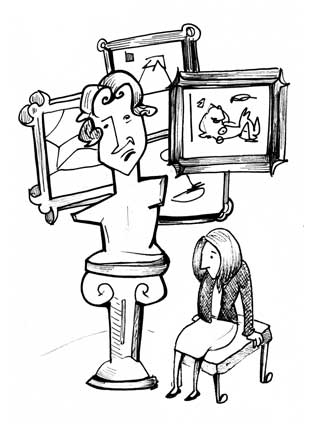 Discussing how many things you get rejected from is probably bad PR, unless you're already so successful that it comes across as reassuring. Talk about it while you're still trying to make a name for yourself, however, it carries the risk of sounding whiney or even worse, naive, setting yourself up for averted eyes and hastily changed subjects. There may be, after all, a very good reason your work isn't making the cut, but everyone is too polite to tell you.
So, at the risk of both of those possibilities, here goes: I have applied for about nine art exhibitions in the last three months or so, and have received, roughly, seven rejections. (The remaining two I haven't heard from yet.) A few of these were easy to shrug of (the artistic equivalent of getting dumped by someone you weren't sure you wanted to date in the first place) though there were one or two that stung in particular, mostly because I'd assumed they were in were in the bag. In my head, I'd already pictured myself in the show, booking tickets to the location and posting triumphantly on Facebook. Yes, yes. Embarrassing now. Added to the pile are an influx of bait-and-switch commissions, which aren't rejections per se, but nonetheless deflating: "We'd love to have your work for [something really cool sounding]" most of which tend to fall by the wayside for whatever reason, once logistics, such as money, get in the way.
The "Bad Art Writing" folder
In my Gmail account, I have a specific folder called, "Bad Art Writing" where I file any particularly atrocious art press release or gallery announcement that gets sent my way. This happens fairly regularly, if you are an artist who is on the receiving end of gallery and artist mailing lists. Bad Art Writing (sometimes known as International Art English), is basically Academic English (AE), which David Foster Wallace probably eviscerated best in his brilliant Harper's essay, excerpted below. Simply substitute the word "artist" for "academic" and "scholar" and it amounts to pretty much the same thing:
…I cite no less an authority than Mr. G. Orwell, who 50 years ago had [Academic English] pegged as a "mixture of vagueness and sheer incompetence" in which "it is normal to come across long passages which are almost completely lacking in meaning."
...the obscurity and pretension of Academic English can be attributed in part to a disruption in the delicate rhetorical balance between language as a vector of meaning and language as a vector of the writer's own resume. In other words, it is when a scholar's vanity/insecurity leads him to write primarily to communicate and reinforce his own status as an Intellectual that his English is deformed by pleonasm and pretentious diction (whose function is to signal the writer's erudition) and by opaque abstraction (whose function is to keep anybody from pinning the writer down to a definite assertion that can maybe be refuted or shown to be silly). The latter characteristic, a level of obscurity that often makes it just about impossible to figure out what an AE sentence is really saying, so closely resembles political and corporate doublespeak ("revenue enhancement," "downsizing," pre-owned," "proactive resource-allocation restructuring") that it's tempting to think AE's real purpose is concealment and its real motivation fear.
There's an addictive, "fun-to-hate" quality about this sort of writing. It's similar to the way I can gleefully despise Sarah Palin or the show Girls, and still be compelled to click on every single knee-jerk piece of click-bait that comes out on those respective topics. Not that this is something I'm at all proud of. As any creative-type knows, hating the work of others is much easier (and lazier) than producing something of your own that's any good, and so far as I can tell, I am no wiser or better off for having read about the societal implications of Lena Dunham's gratuitous nudity or Palin's latest outrageous tweet, or whatever other distraction was making the rounds last week.
But my hatred of Art/Academic Speak is a little more personal than hating an inane politician or a TV show. I think all artists are done a disservice when this type of writing is seen as perfectly acceptable. How can the phrase "questioning the commerce or carelessness of re-appropriation through producing a space-as-document," or "our cultural presentation of identity and contain ambiguous or potentially contradictory statements about their creator" be uttered with a straight face? Why are "notions" of [insert perfectly stable art form, such as painting] always being "challenged?" (Which of course, always just translates into, "The artist decided to do something different.") The reasons this is a detriment are obvious (I hope). Terrible art writing is a distraction from art that's actually good, it makes the artist look insecure at best and like a disingenuous jackass at worst, and artists who would never dream of writing this way feel obliged to, so that they may join an exclusive little club of People in the Know. But unfortunately, bad art writing is mostly shrugged off, on par with going to the Scottish highlands and complaining that everyone there speaks with an impenetrable accent. (Well, of course they talk that way. What did you expect?) And as International Art English cofounder David Levine points out: "The more you can muddy the waters around the meaning of a work, the more you can keep the value high." Maybe that's a handy insider's trick, but hearing it said outright is heartbreaking. Has it come to this? Is squelching clarity really the key to the kingdom?
Here's the thing that makes me a tad sympathetic, however: writing about art is hard. Very hard. And even harder to do sincerely, maybe moreso for artists than anyone else. When artists create work I suspect many* are not even in the same universe as words; they are hanging out in some meditative zone where language itself ceases to exist. My absolute favorite aspect of drawing—and also the thing about it that makes it easier and more enjoyable than almost anything else I do—is that during its creation, I do not have to talk about it. Because I can't, or at least, not very well. There is literally nothing to say; the image is handling the Saying part for me. Thinking and explaining and making a case for oneself is never the point when I draw. But admitting, "I just wanted to see what happened when I expanded this shape," or, "this composition felt right to me after looking at a book of Saul Steinberg drawings" doesn't sound all that smart or interesting, and yet again, it's easier to revert to vague, nonsensical prose.
Still, I'd like to think we artists can do better. We can omit needless words. We can sound like human beings and not like random adjective generators. We can admit that these things are not easy to write about, and be honest when we don't know what we're doing instead of disguising it in blabber.
Too much stuff
One of my least favorite aspects of art-making is that it takes up so much space. Yes, I know. That's kind of the whole point. But in a way, I hate that part too--the sad knowledge that the activity I enjoy the most will, at the end of the day, result in my producing another thing, in a world that is arguably already overrun with too many things. Not that it'll stop me from drawing, of course, but it's kind of a depressing thought to have while cleaning your desk. Not that I dwell on this all the time. To be fair, I've been enjoying the holiday season more than I anticipated, actually relishing walking past Christmas tree sales, enjoying the odd snow day and boozy holiday parties and all that, but the appeals to shop are exhausting. I am tired of stuff. Tired of being a Yet Another Artist Trying to Sell Stuff, frankly; I just want my work to go to good homes to people who happen to like the drawings and not do any of the uncomfortable-but-neccessary work required to entreat people to buy it.
And, um, now that I'm done kvetching, here are a few pieces of art I have for sale.
Map of New York
And I added a map of New York to compliment my map of DC since we all know New York enthusiasts tend to be much for fanatical than DC enthusiasts. This is also available on Society6.
And as always, any art-lovers and/or Christmas-shopping procrastinators who would like to purchase original art are welcome to contact me for prices and availability. As I mentioned earlier, the drawings are starting to pile and need good homes.
The Art of the Kitty Cat
Put a cat on it > put a bird on it.
Last November I created a mini-comic about the phenomena of the Cat Bachelor (after overhearing two of my male friends discussing their respective cats at a party and realizing that this was a Thing). Over time cats have become one of my default images—the stockpile of stuff I can doodle repeatedly and never seem to tire of. They are much easier to draw than humans and (sadly) much more crowd-pleasing.
Below, some of my favorite illustrators takes on cats:

The Saul Steinberg Cat.
An Edward Lear cat.
The Edward Searle Cat, though I think I like that fish more.
Some praise for the Handbook
A friend of mine who read a late draft of The Unsuccessful Artist's Handbook had this to say about it:
Also first off, it just bowls me over with its honesty. It hits me in the heart. I don't know how you feel it, or what your awareness is, or whether it costs you or comes naturally. I'm really envious. I am not, in life or art, forthcoming or straightforward or candid. Not because I don't want to be those things, but -- but this isn't about me [he said, dodging further reflection and revelation]. There's a quality to the honesty that hits me in the heart, that I'm envious of, that I think we're all a bit thirsty for.
Again, you can buy a copy here. Makes a great Hannukah gift! Or not.
In other news—well, there isn't much at the moment, except that my new coaster business cards came in [see right], and I am fairly pleased with them. Also, I have been having fun with my Studio page, which contains semi-regularly documentation of my studio. (I'm a shameless snoop when it comes to other artists' studios, so I figured it would be kind to return the favor.)
Why I Am Not An Illustrator
Now that my show's up and running at Flashpoint, and people occasionally write about it, I've noticed that I'm usually referred to as an illustrator but never a fine artist. Which isn't something I take offense at, of course, but is not a description that seems entirely accurate.
Yes, I am being pedantic. I have a degree in illustration after all, have taken on the odd illustration job in the past, and most of my favorite artists tend to be illustrators or cartoonists. But for the small subset of people who do care about such distinctions, here is why I am still not an illustrator:
Illustration is a blanket term that implies that the work in question is depicting a specific idea. The best definition of it I ever heard actually came from the cartoonist Dash Shaw, at a reading at Atomic Books: "An illustration tells you what a thing is, and how you should feel about that thing." Fine artists can get away with saying something like, "This piece is about space and light" and no one will ask any follow up questions. An illustration, on the other hand, needs to have some semblance of specificity—the work needs to be about something, not just its form. My drawings may be cartoonish and representational, but it is never 100% obvious as to what they are about in the first place, which to my mind, disqualifies them from being illustrations.
Fine art also means you don’t have to answer to art directors, which is why I chose it, or rather, it chose me. But it was never that I didn’t want to be an illustrator. I would love to be the type of artist who can read an editorial and create a piece that wordlessly captures its point of view, and I am wholeheartedly jealous of anyone who has that ability. It’s just that I realized having to draw something in particular was my equivalent of artistic cyanide. The only way I know how to draw anything good is to be as unspecific about its meaning as possible.
Occasionally you will hear illustration used as a derogatory term, i.e., the whole, "That's not art, it's illustration" sniff, if a piece in question appears too commercial or heavy-handed. There are some heartbreaking pictures that do look as though they were manufactured by a machine in a factory, but I still bristle when I hear that slam, as it's generally a lazy shorthand for, "This is why you don't have to care about it." Illustration and fine art are different beasts, and there are lots of blurry lines between the two, but to say one is superior or more important than the other is just plain wrong.
At any rate, dwelling on definitions gets tedious pretty quickly, and the more interesting conversations tend to be about the art itself, not what taxonomy it falls under. And as a former English professor once said, when students were explaining the differences between Painting and GFA majors: "Whatever. It's all pictures."
The topic that never gets old
There is one topic that never seems to get old among us creative types, and that is how difficult it is to do creative work in the first place. Oh yes, you think. Please tell me just how hard this wholly optional activity is. Let's talk about other fellow artists who have spent the day procrastinating and feeling like failures for not working, or throwing out entire days worth of drawings, or hours trying to squeeze out a single sentence that doesn't sound dumb. And the solidarity is easy to find, along with motivational posters encouraging you to struggle through the hard parts, or reassurance that getting stuck does not necessarily mean that your painting is doomed. Then of course, you realize—horrified—that you have just spent forty minutes searching for words of encouragement on the Internet instead of getting anything done, and the cycle of shame repeats itself.*
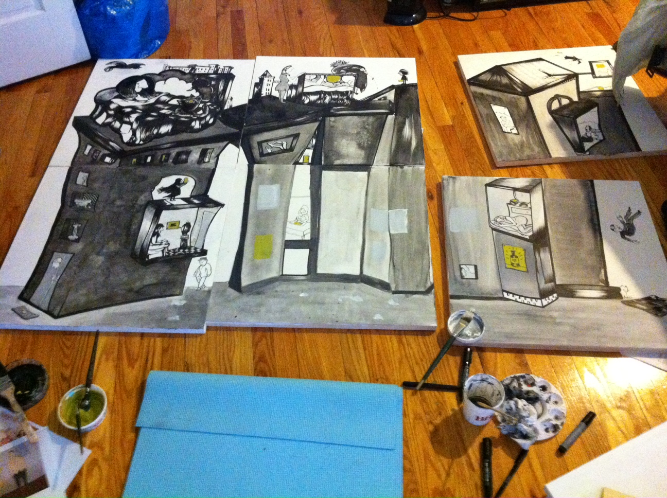
I've spent the better part of the weekend working for an upcoming show I have in August—details to come soon—which involved the usual mixture of artistic highs and lows. I did, sadly, have to scrap an entire 24x24'' panel because its composition was unsalvageable, but it felt like the right thing to do. As I drew, a Saul Steinberg quote constantly repeated itself in my head, on a loop: “What you respond to in any work of art is the artist's struggle against his or her limitations.” Which seemed to be everywhere.


